LEGO Wear
An independent concept: extending LEGO's building-block identity into a wearable fashion label, from collection and packaging to store and campaign.
- Role
- Concept development, creative direction, AI-assisted visual and motion production, and art direction across collection, packaging, retail, styling and campaign work
- Date
- June 2026
- Year
- 2026
- Category
- Branding, AI Motion
- Project Type
- Independent Concept Project
- Tools
- Nano Banana, Leonardo AI, Pomelli, Canva, Google Veo, Seedance
Note: LEGO Wear is an independent, unofficial concept project created for portfolio purposes only. It is not a commissioned project, and it is not affiliated with, sponsored by, or endorsed by the LEGO Group. LEGO® is a trademark of the LEGO Group, which does not sponsor, authorize or endorse this concept.
00
Overview
LEGO Wear imagines a fashion label built on LEGO's own visual language — the brick, its primary colours, and the idea of a system made of interchangeable parts. The concept covers a full brand extension: a modular collection, product identity, packaging, a retail space, styling, and a campaign, produced end to end with AI-assisted visual and motion tools.
01
The starting point
From play to a wearable identity — the starting point was a simple question: what would it look like if the logic behind the brick, not just its logo, became a clothing system? Merchandise built purely on a logo reads as licensing. The goal was a label that carries the brand's actual design principles — modularity, primary colour, and the satisfaction of things clicking together — into clothing someone would choose to wear on its own terms.
02
Approach & strategy
A modular fashion system — rather than designing one collection, the brand extension was structured as a system: a fixed identity (wordmark, colour trio, detailing language), a set of modular pieces that recombine across ages and occasions, and consistent rules carried through packaging, retail and campaign so every touchpoint reads as the same label.
03
A familiar identity, extended
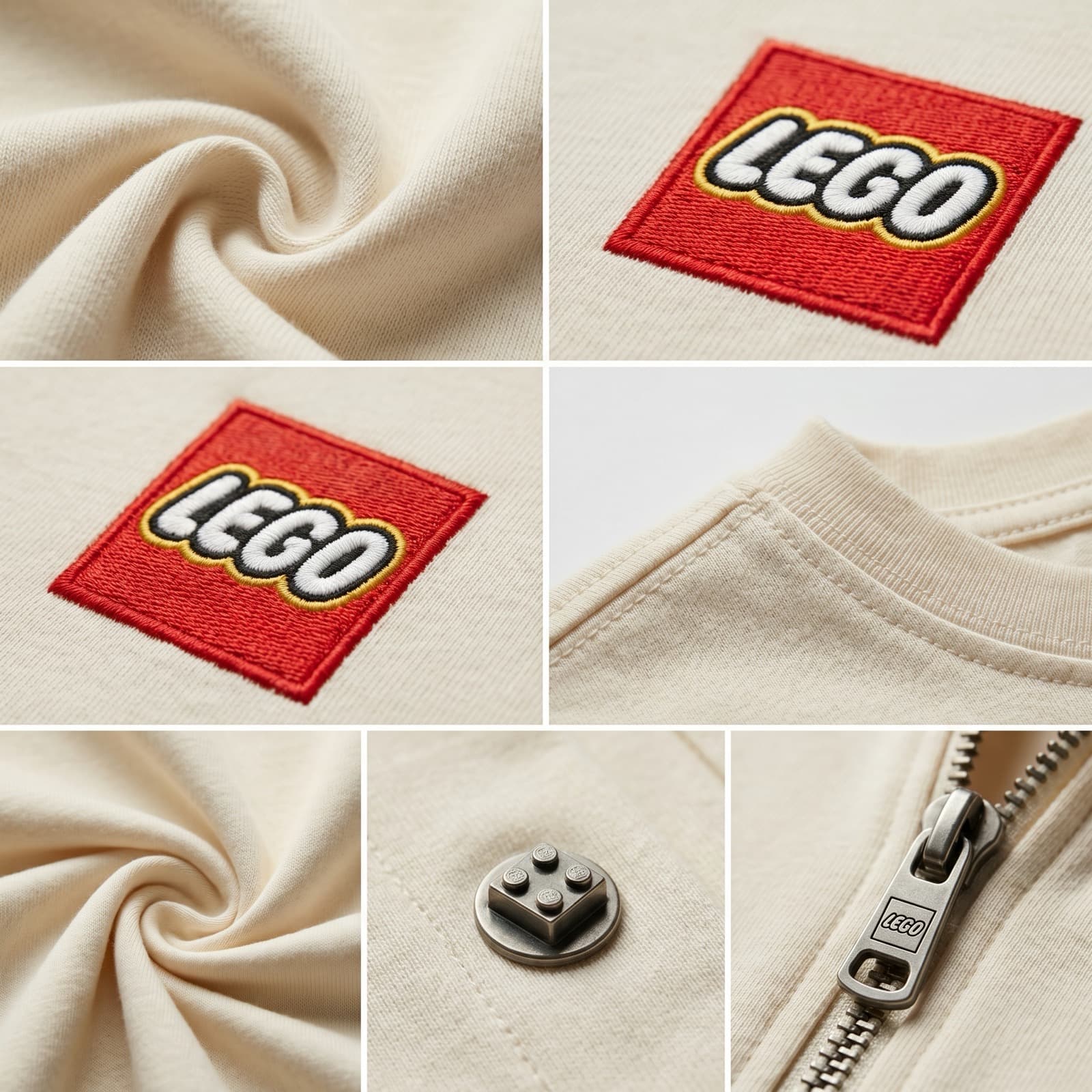
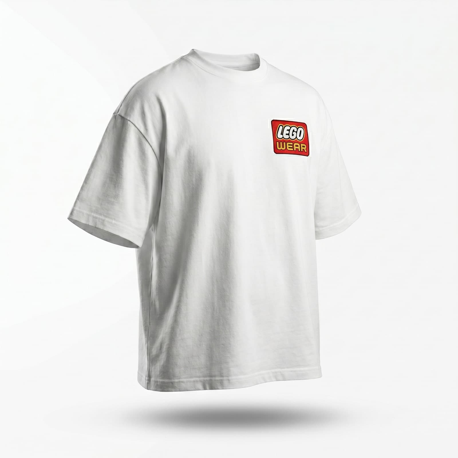
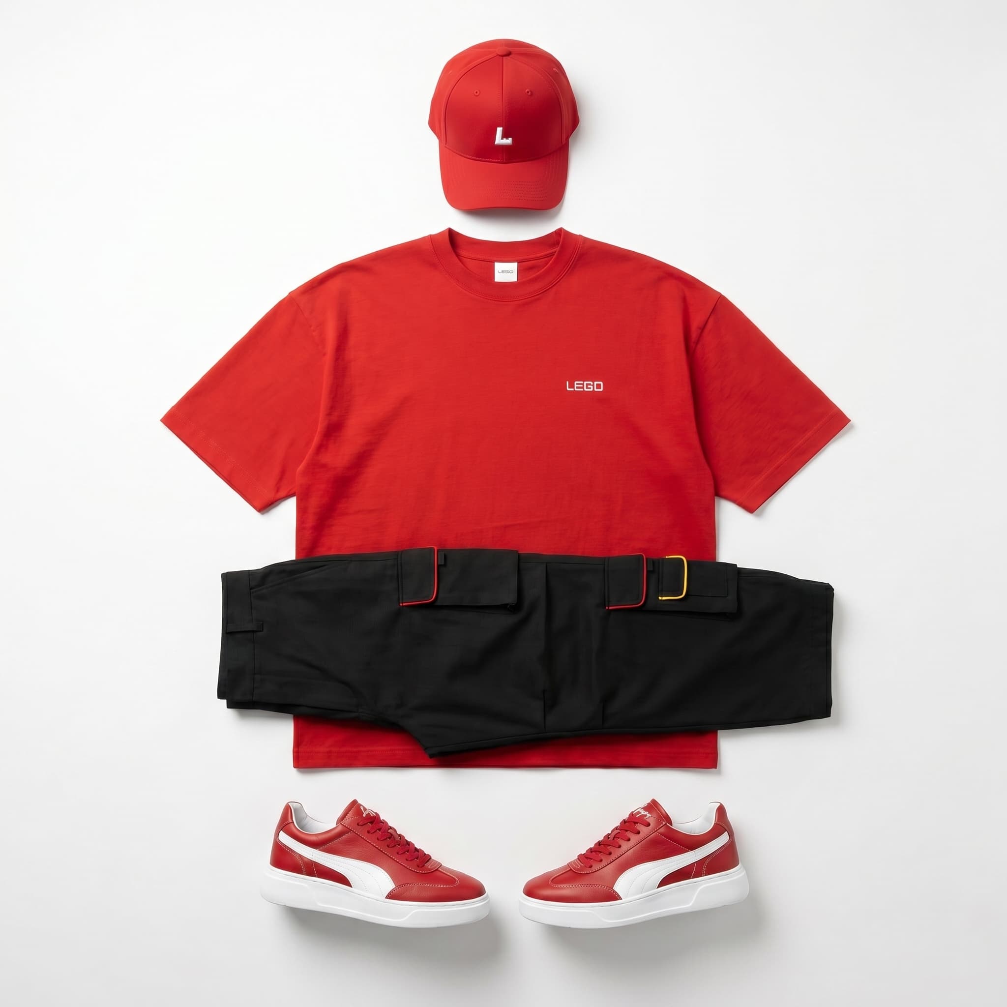
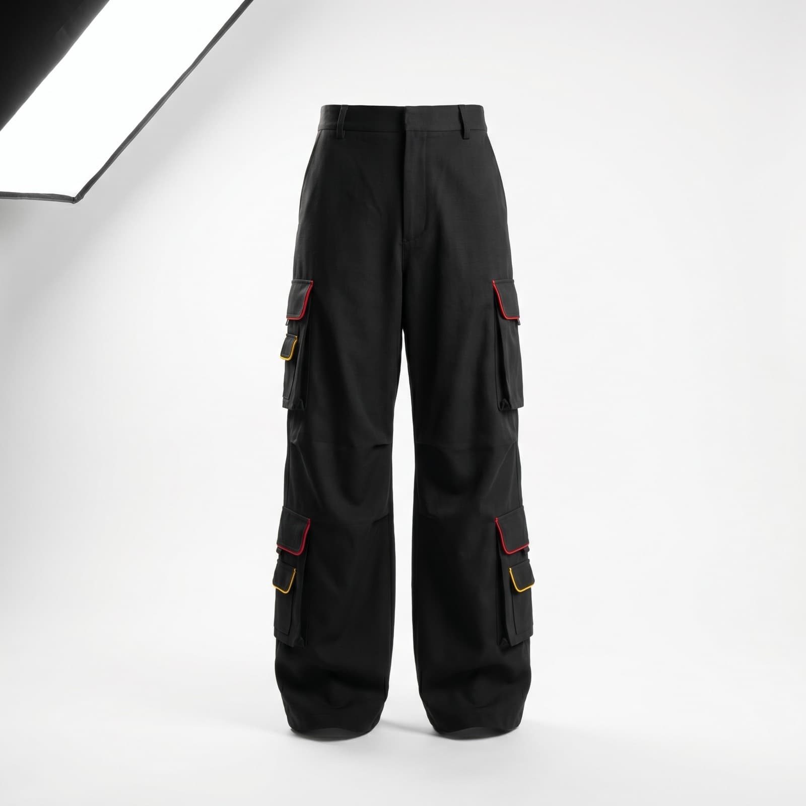
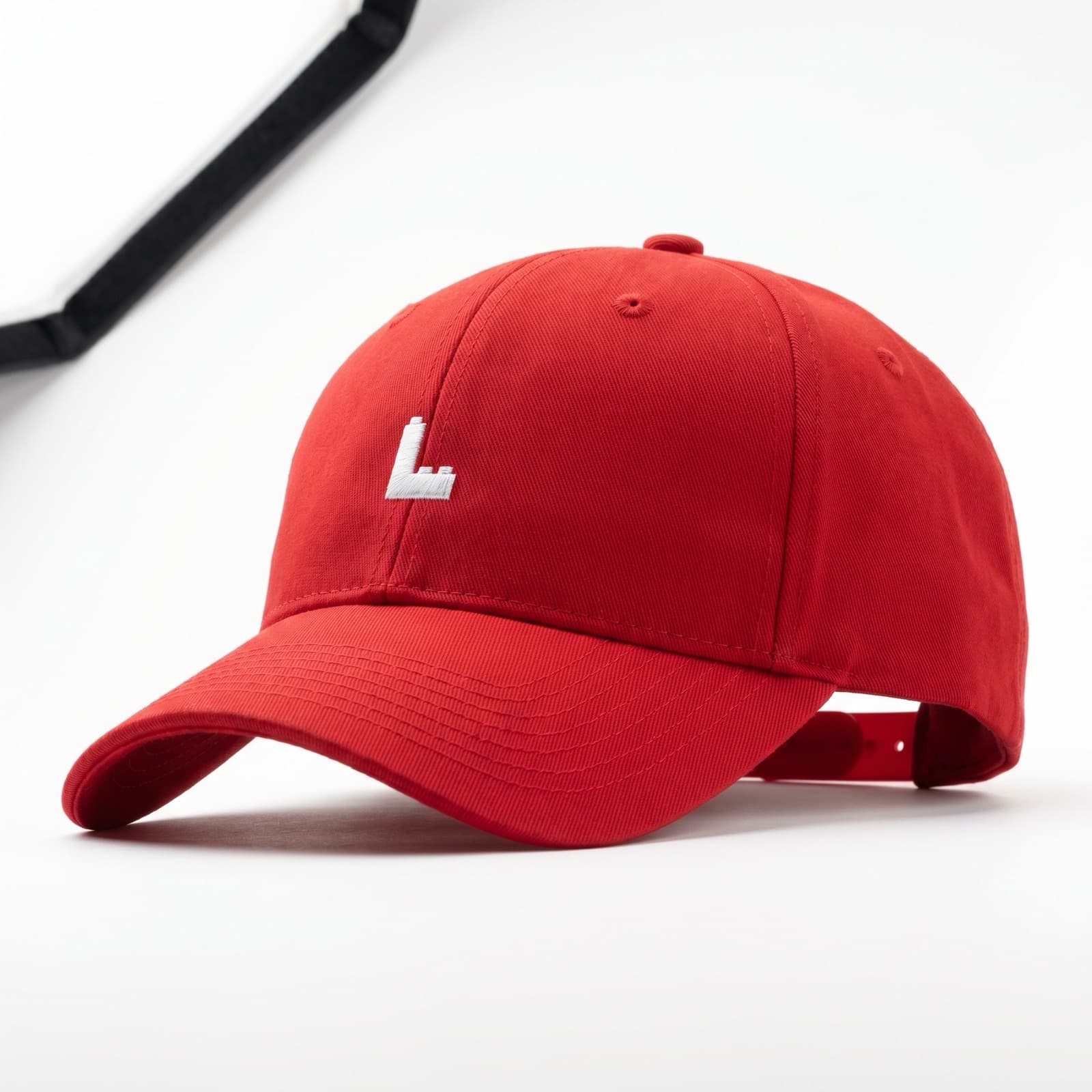
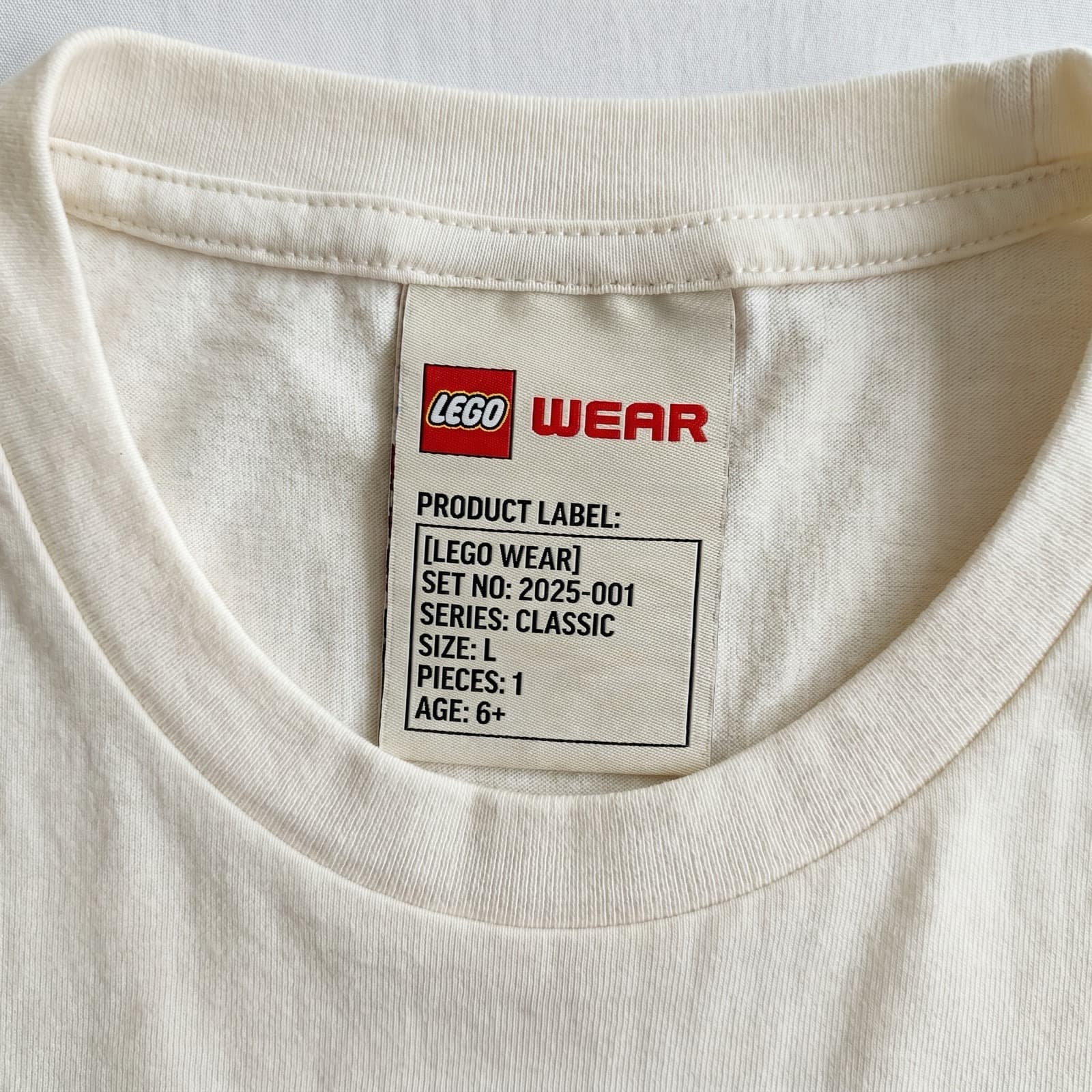
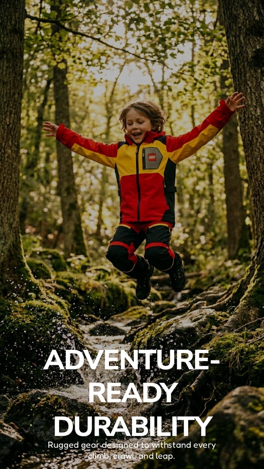
The identity keeps LEGO's own wordmark and colour logic intact rather than inventing a new one: a fixed red, black and yellow palette, a chest-level wordmark, and small construction-inspired details — a brick-shaped stud, contrast piping, a zipper pull — that make the connection to the brick legible up close without turning the clothing into a costume.
04
A modular collection across generations
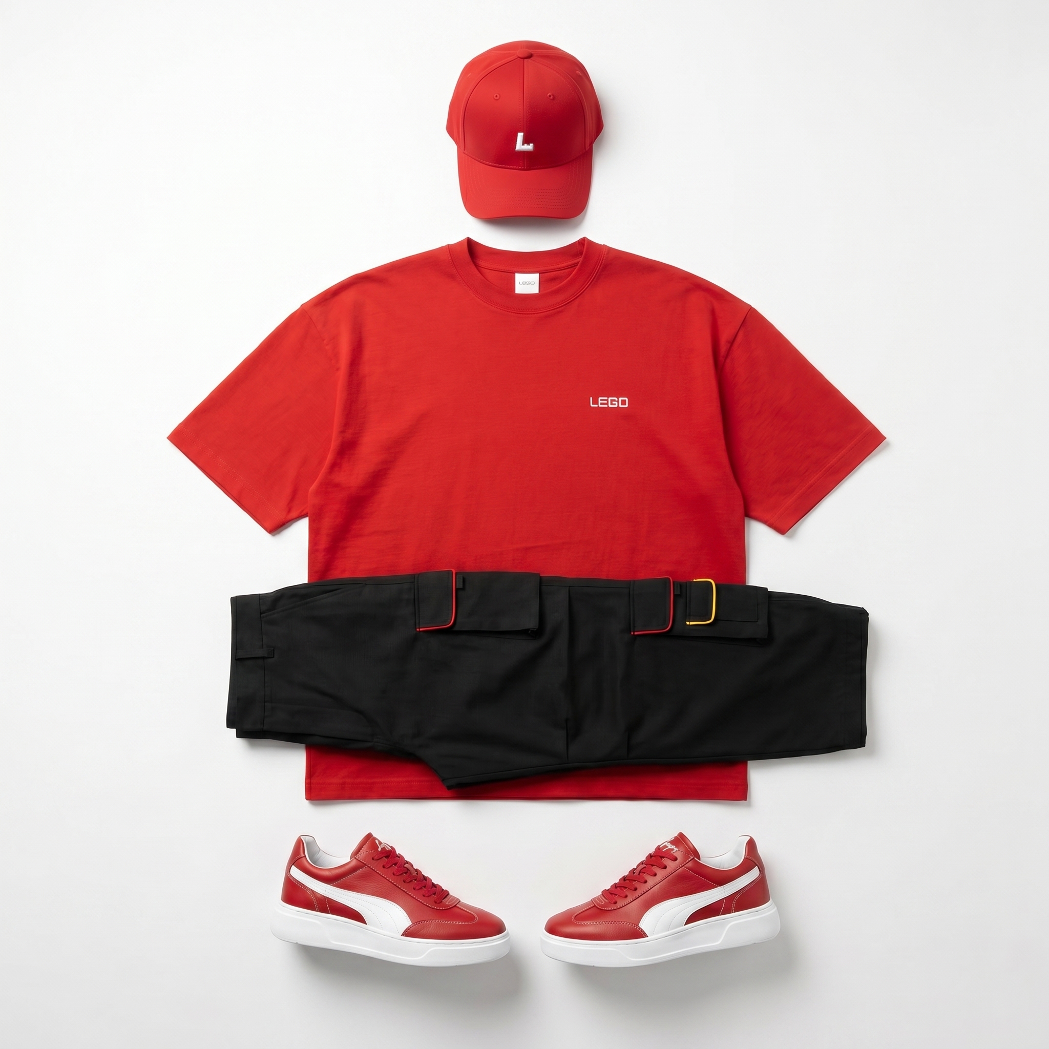
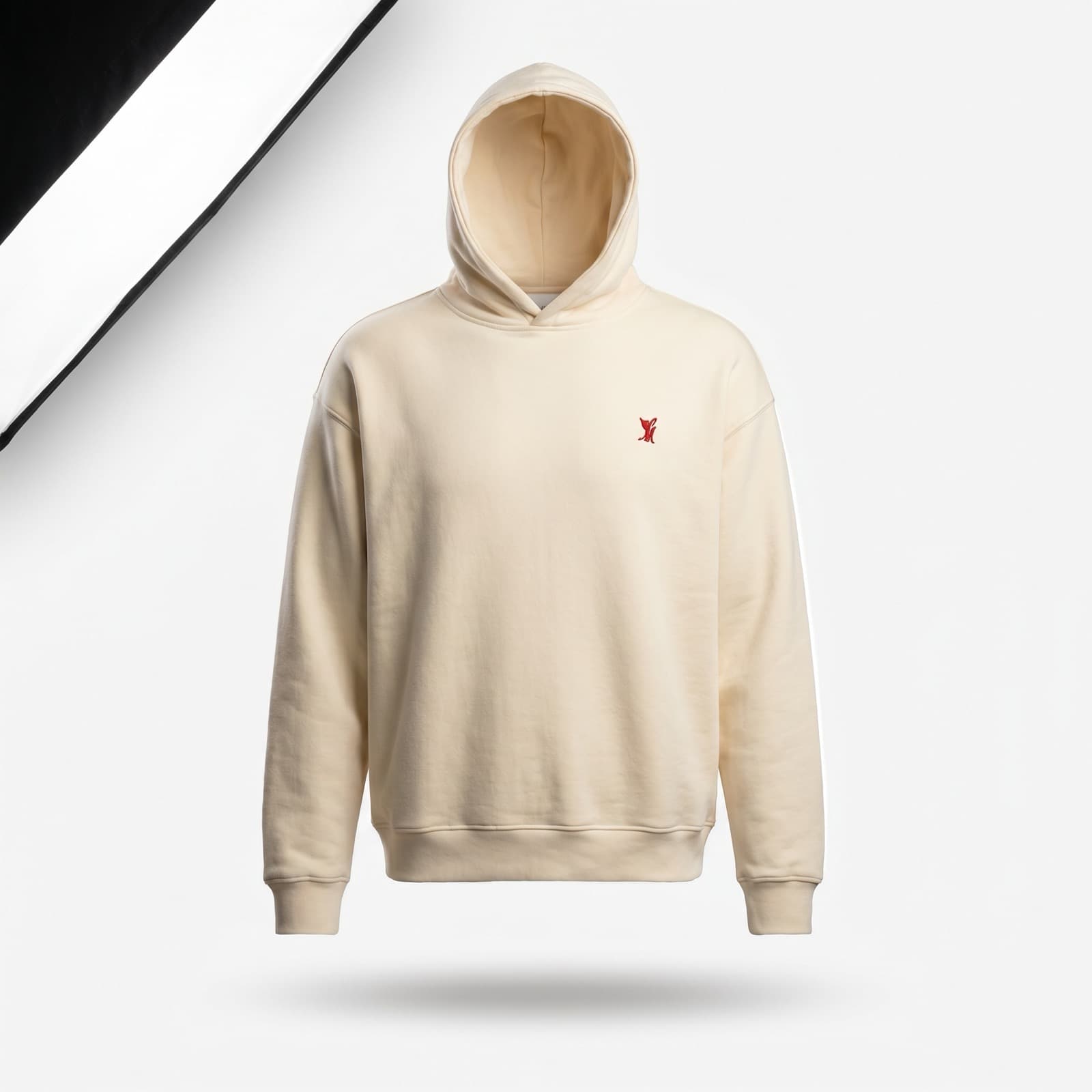
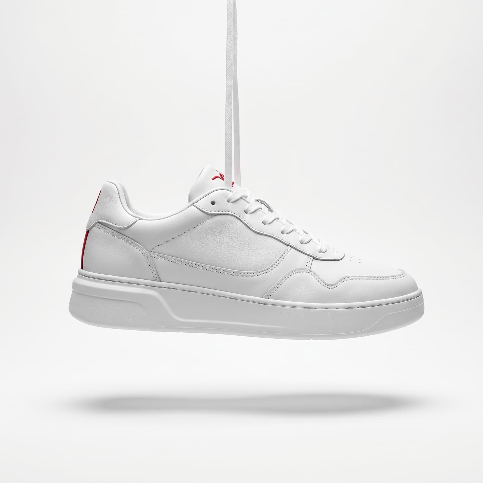
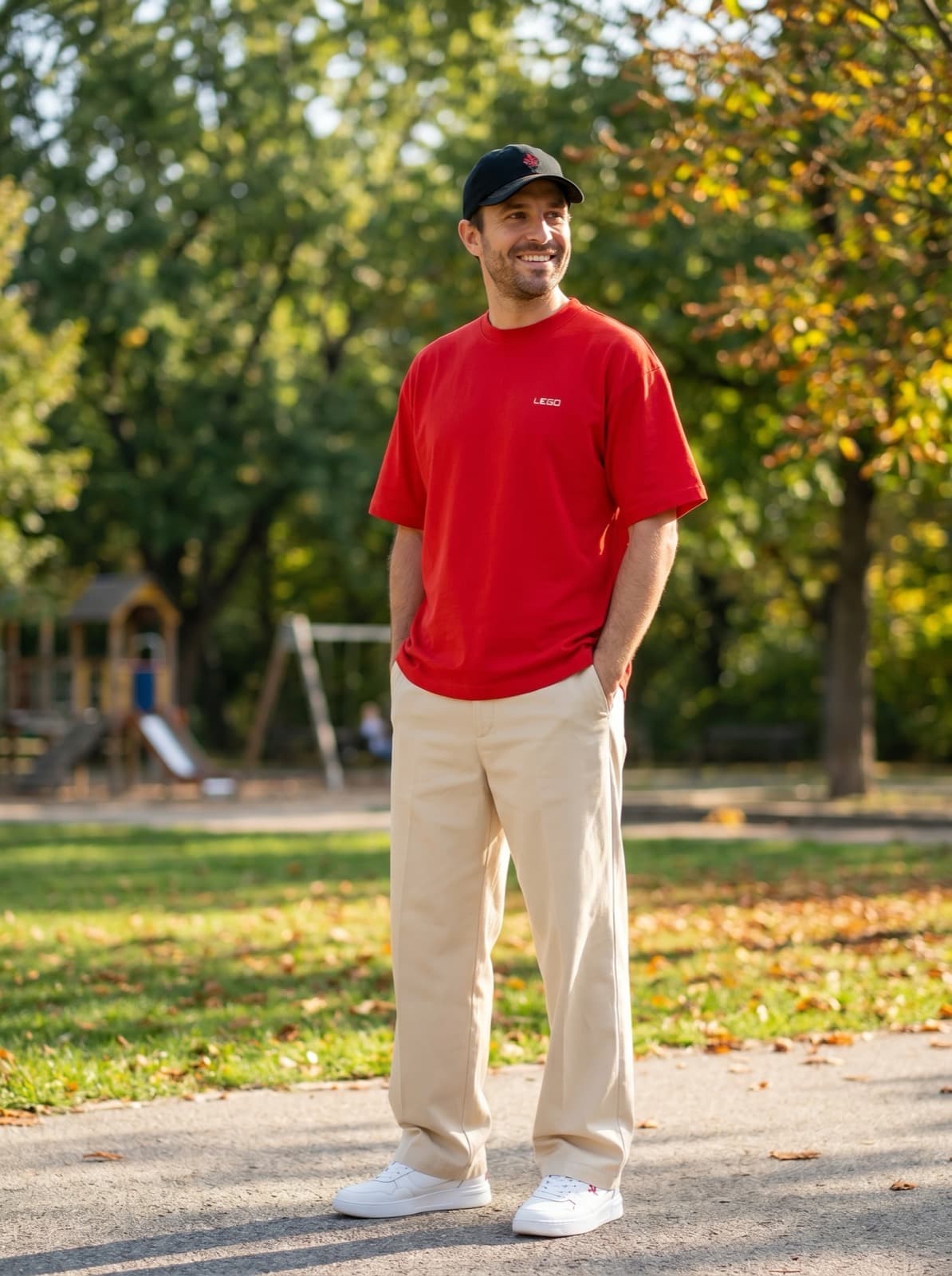
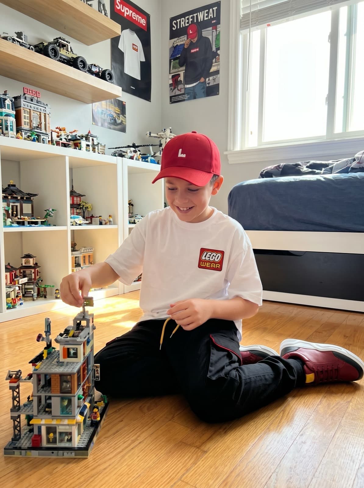
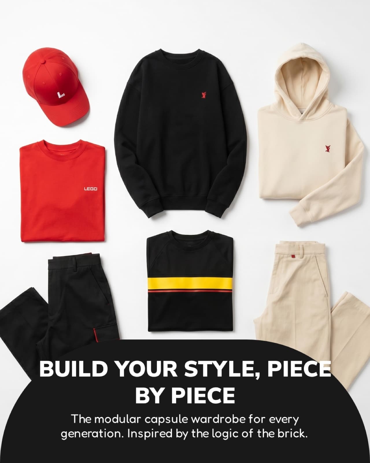
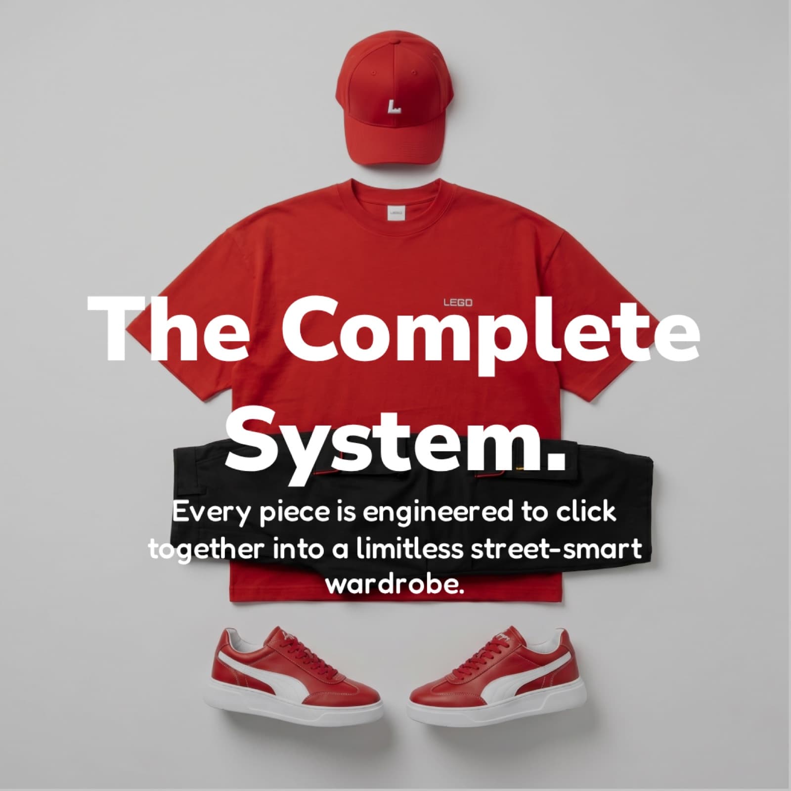
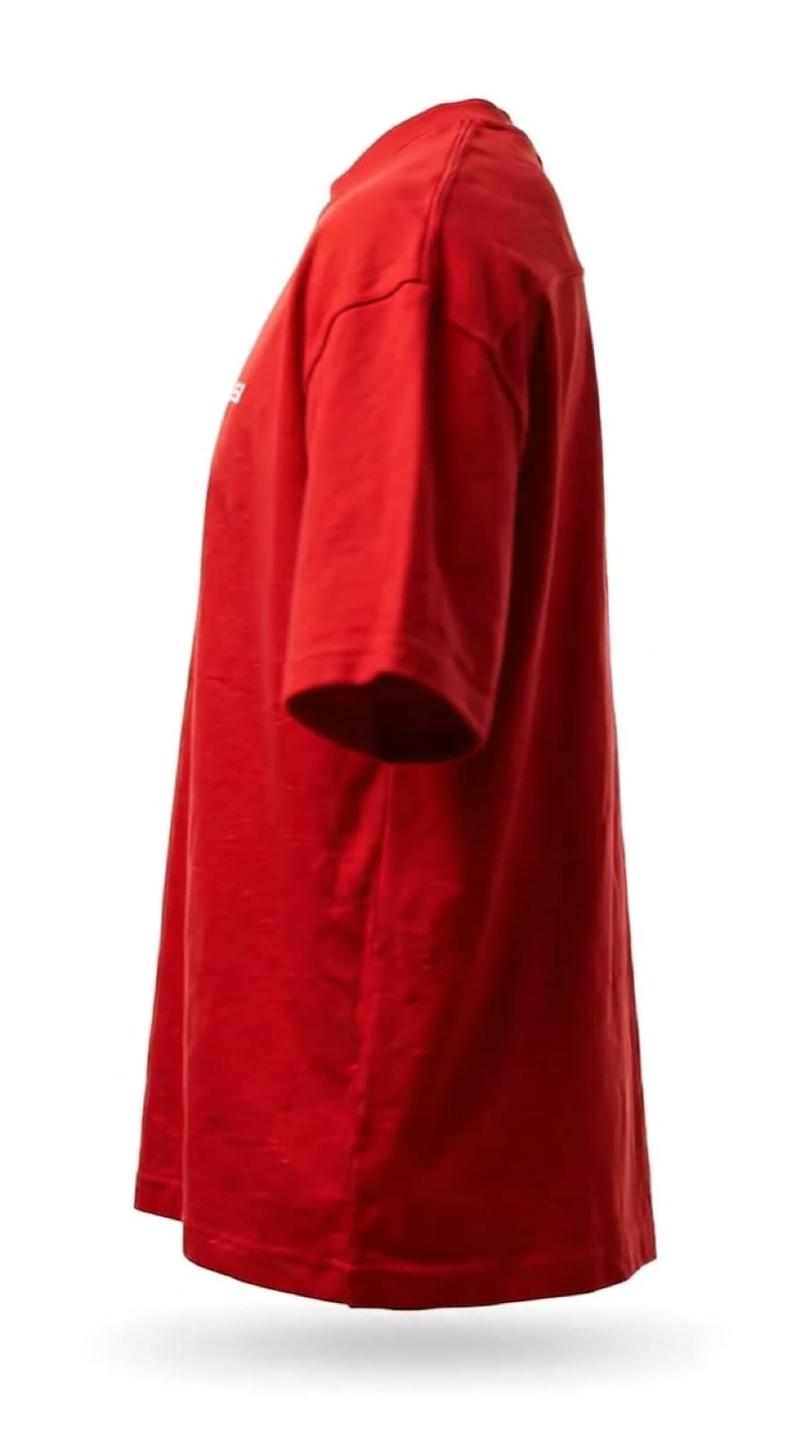
The collection is built to recombine: oversized tees, sweatshirts and hoodies pair with cargo pants or wide-leg bottoms, caps and clean sneakers, so pieces work as a system rather than single looks. The same language scales down for a younger fit without becoming childish, and up for an adult wardrobe without losing the brand's playfulness.
05
Turning unboxing into part of the experience
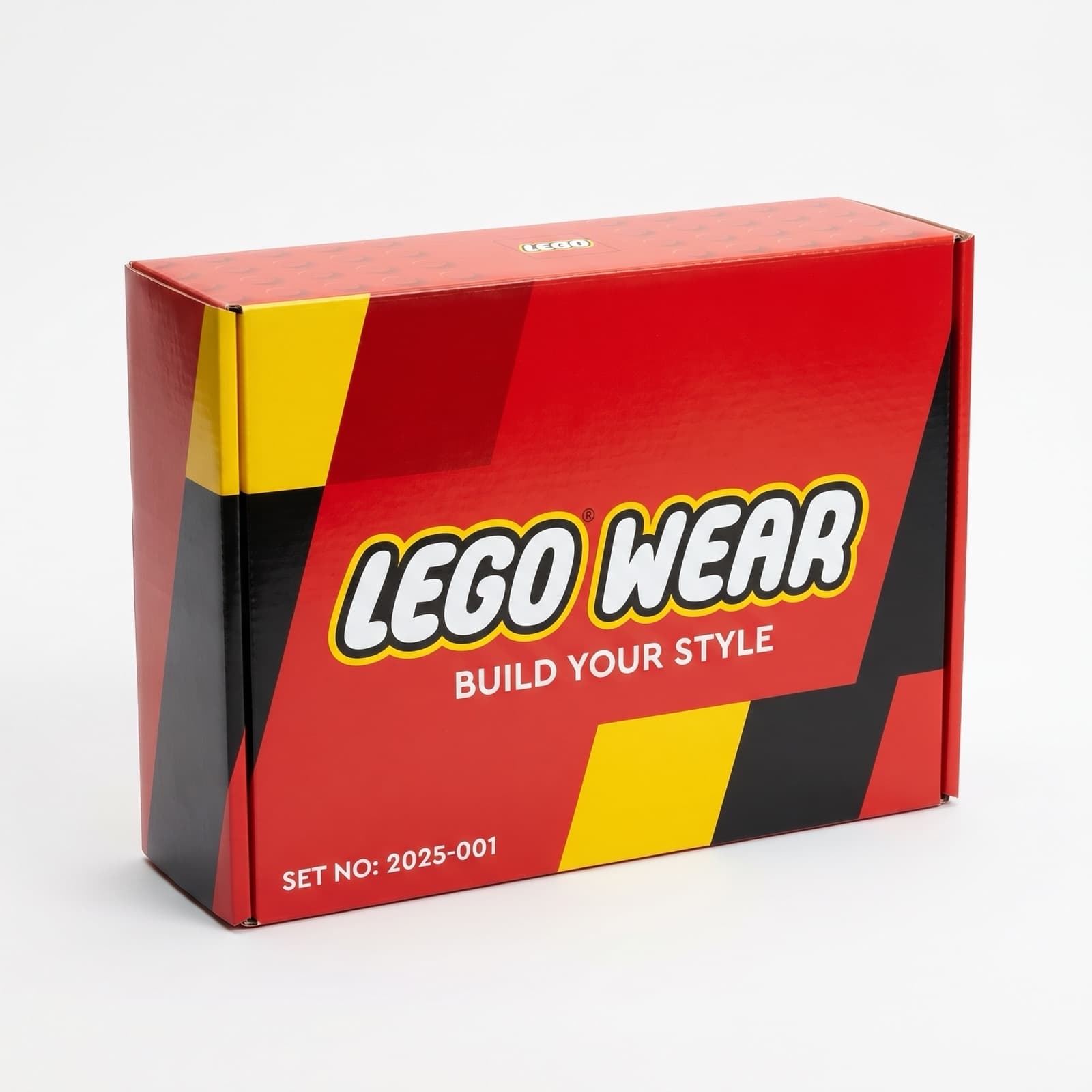
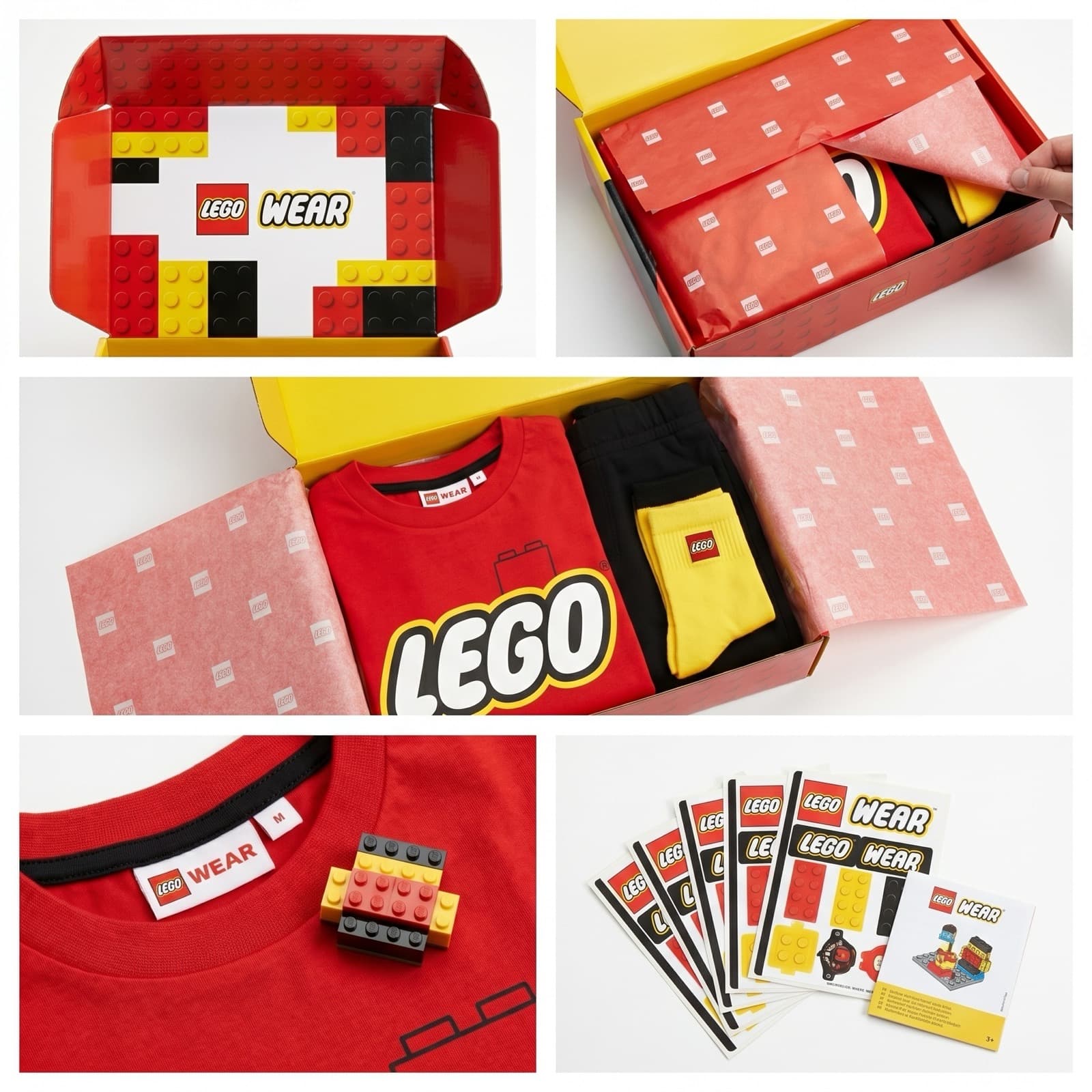
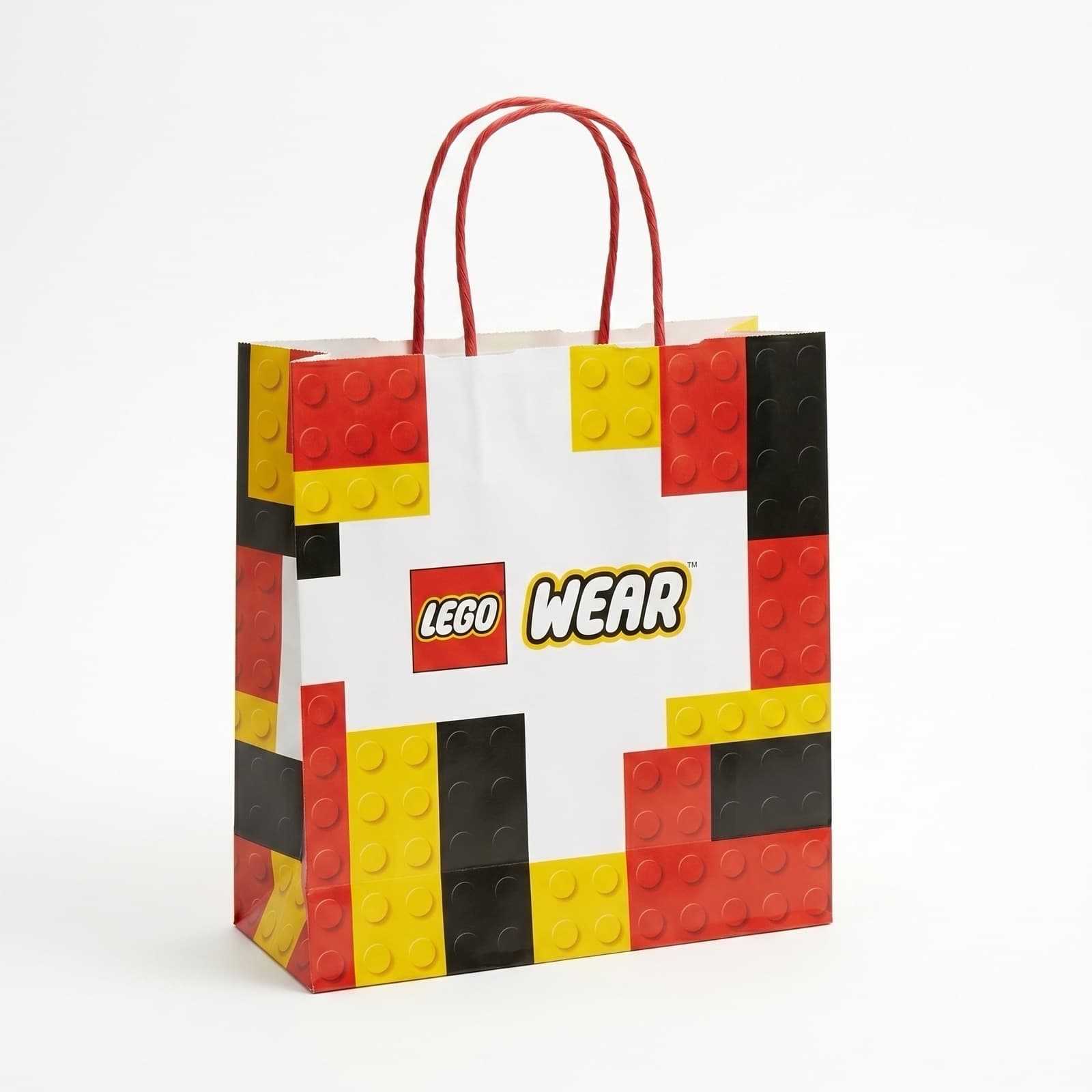
Packaging carries the same red, black and yellow system onto the box, the shopping bag and the inner wrap, so opening it feels like an extension of the product itself rather than a separate, generic layer.
06
A store designed like a set
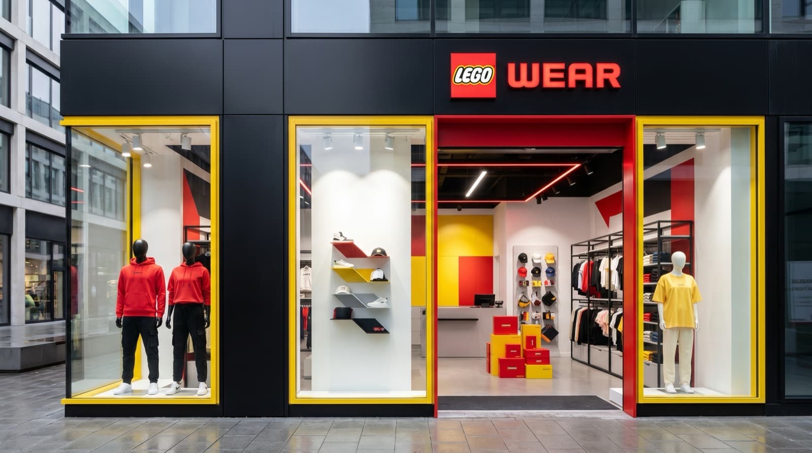
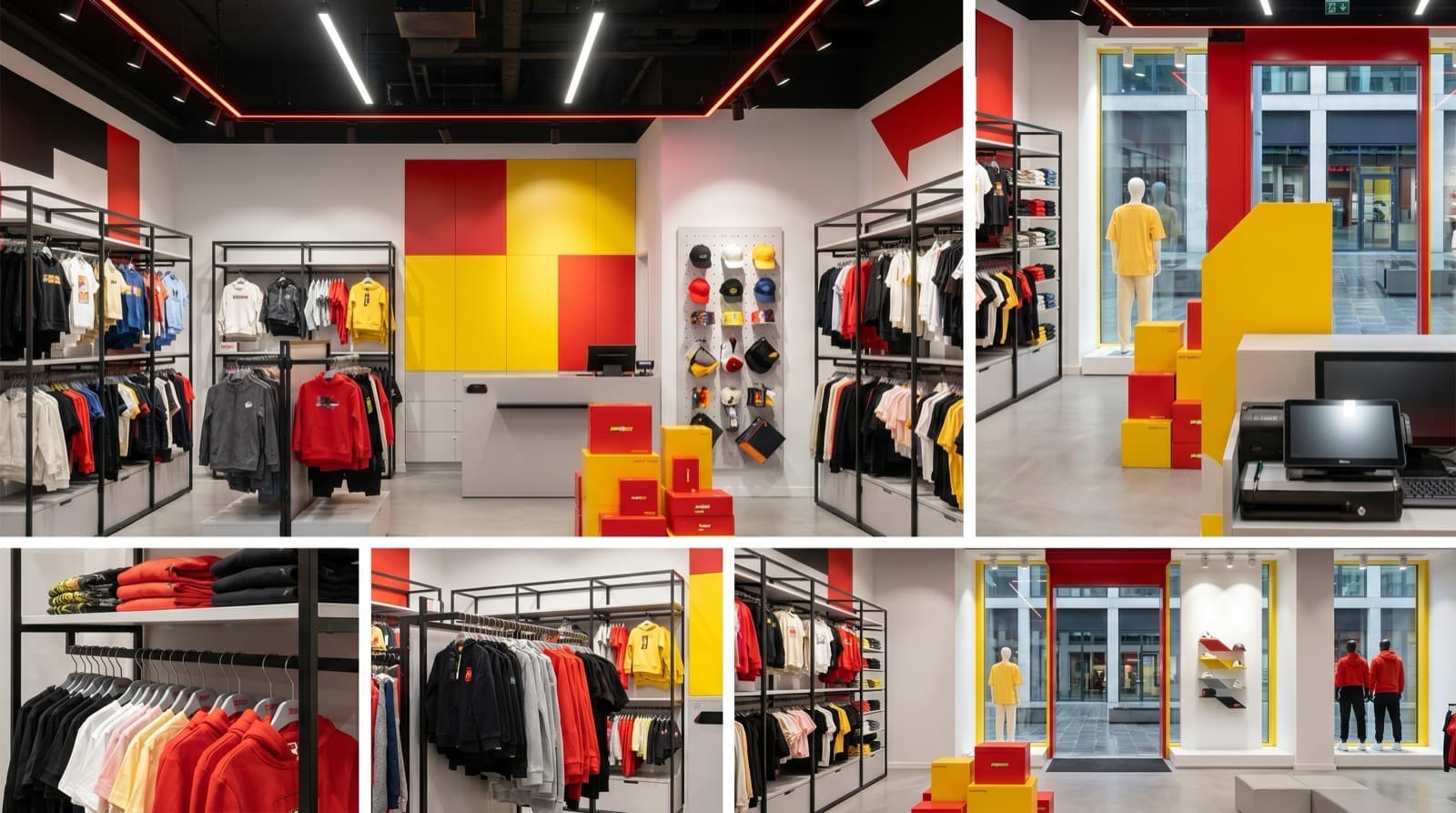
The retail space treats the storefront and interior as one connected scene — clean signage on the exterior, then shelving, displays and product staged inside with the same colour discipline, so the store reads as part of the same system as the clothing.
07
Bringing the collection into everyday life
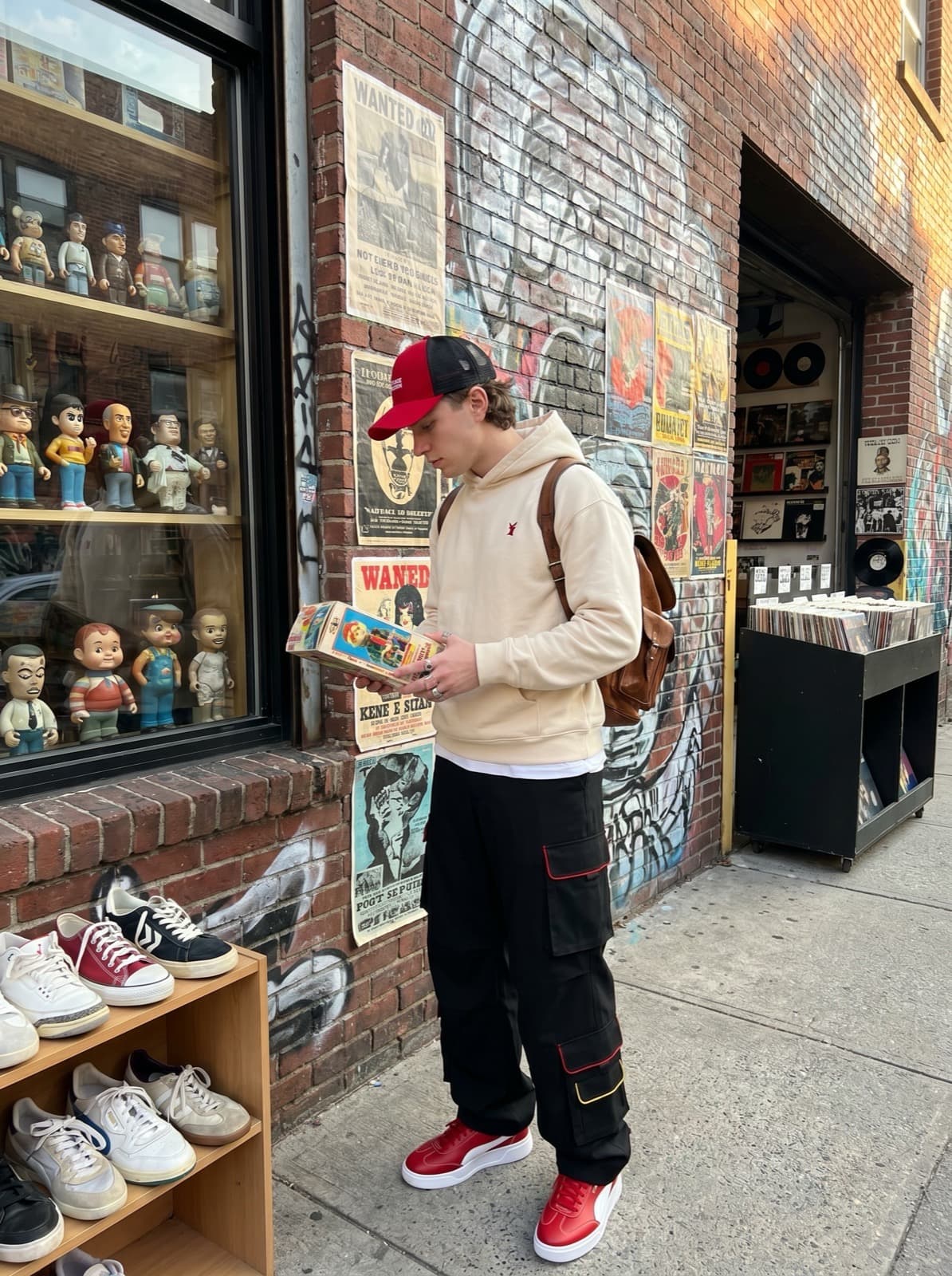
Styling moves the collection off the rack and into real settings — a street-style look outside a record store, an everyday park outfit, and a younger fit worn at home — to show the same pieces working across ages and occasions rather than only as a flat product shot.
08
One system across campaign scales
The campaign is built around a single idea, "Build Your Style," carried across formats — a square social post, a portrait lead visual, and a vertical out-of-home format — with the same headline logic, grid and red-yellow-black system holding it together at every scale.
09
From static concepts to motion
Production combined Nano Banana and Leonardo AI for product, model and environment imagery, Pomelli and Canva for adapting that imagery across campaign formats, and Google Veo and Seedance for turning static concepts into short-form motion. Keeping a single visual identity consistent across that many tools — rather than any one generation step — was the real creative-direction challenge of the project.
10
Production process
- 01
Identity and colour system
Defined the identity around the existing LEGO wordmark, a fixed red–black–yellow trio, and a small set of construction-inspired details (contrast piping, brick-shaped hardware, a chest wordmark) applied consistently across every product.
- 02
Collection and product development
Developed a modular collection — oversized tees, sweatshirts, hoodies, cargo pants, wide-leg bottoms, caps and clean sneakers — designed to recombine into full looks rather than stand as one-off pieces, spanning both adult and younger fits.
- 03
Packaging, retail and styling
Extended the same identity into packaging, a retail space and styling direction, then produced campaign visuals and a short motion piece — combining several AI tools for product, model and environment imagery and keeping visual consistency across all of them as the central creative-direction challenge.
11
Key decisions
Preserving brand heritage
The identity builds on LEGO's existing wordmark and colour logic instead of replacing it, so the extension reads as the same brand rather than a reinterpretation of it.
Using modularity as a shared principle
The idea of interchangeable parts runs through the collection, the packaging and the campaign system alike, not just the clothing itself.
Remaining playful without feeling childish
Colour and detail stay expressive but controlled, so the label reads as fashion first and a toy reference second.
Making the collection collectible
Pieces were designed to recombine across looks and generations, encouraging a wardrobe built up over time rather than a single outfit.
Managing consistency across tools
Product, model, environment and motion imagery came from several different AI tools; maintaining one coherent visual identity across all of them was the project's central production challenge.
12
Outcome
LEGO Wear exists as a complete, self-directed brand-extension concept — collection, identity, packaging, retail, styling, campaign and motion work produced end to end. It is a portfolio piece with no commercial partnership, sales, or real customer outcomes attached.
13
What I learned
This project was as much an exercise in creative direction as in design. With several AI tools involved across product, model, environment and motion work, the real discipline was holding one visual identity together across all of them — fixed colour rules, consistent detailing, and a clear point of view carried from a single tee through to a campaign billboard. It also reinforced that a convincing brand extension has to carry a brand's underlying logic, not just borrow its logo.
Next project
← Previous: Guestoria
AI Fashion & Motion Campaigns. View Case Study
A series of independent concept studies in which I reinterpreted fashion and beauty imagery with AI and translated selected static campaign ideas into short-form motion.